2014 Alternate Unis?

Those uniforms are horrible. After last year being a step up from the scrabbleforms we wore against Wisconsin, I thought we might be moving in a better direction. It looks like a menstrual cycle.

I'm incredibly disappointed.

 
Last edited by a moderator:
nevermind, i thought since we had a home game against UIUC last year, we would rotate and face them in illinois

 
Last edited by a moderator:
I hope so, that would rustle a ton of people's jimmies

and be hilarious

 
Last edited by a moderator:
Man. Awful and garish is what I'm thinking. Our alts should be black. Black matte helmets, black jerseys, black pants. Dark and bad with mean streaks of red.

This...this an abomination.

 
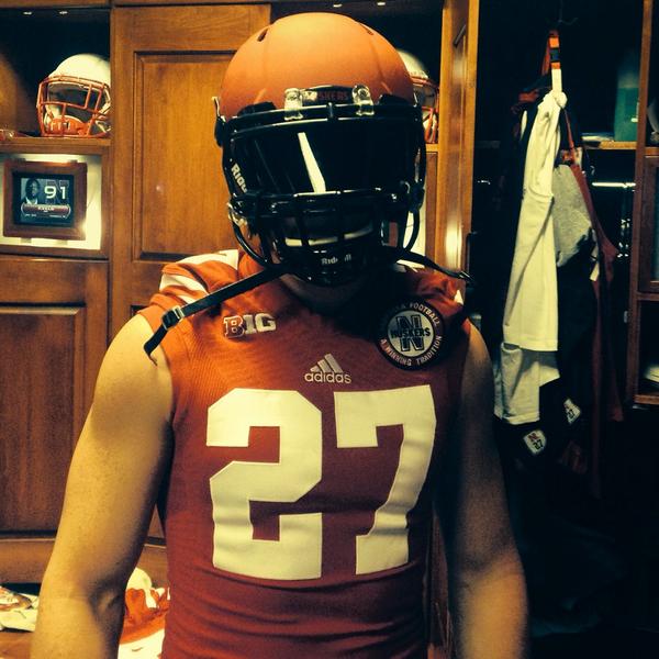
I don't know why we can't go with a red top and white pants, but with different styling, trim, numbers, throw in some black/silver/gray, I don't care. But god the blood clot look was horrible once, it's horrible again. Even the helmet caught the disease this time. It looks like our whole team caught Ebola and is just hemorrhaging scarlet out of every orfice. There is nothing interesting about this from a design standpoint other than the N on the pants striping, and you can barely see it because the red overwhelms everything.

What the f#*k.

 
Last edited by a moderator:
Bane ‏@NathanGerry 12m

YESSSIR
2757.png
2757.png


Bt91fUeIQAEgTLy.jpg


Sam Foltz ‏@samfoltz27 5m

Pretty pumped about my new helmet this year! #heismanyear #puntersarepeopletoo

Bt93VsBCYAEF1mL.jpg


Back
Top