You are using an out of date browser. It may not display this or other websites correctly.
You should upgrade or use an alternative browser.
You should upgrade or use an alternative browser.
Alternate Uniforms 2019
- Thread starter The Maudfather
- Start date

ColoradoHusk
Heisman Trophy Winner
RedSavage
All-Conference
It's 2019 so I feel okay saying it's given me some pleasure as well.The black jersey looks to be ribbed for her pleasure.
CapoValley
Banned
There’s nothing wrong with these, but didn't Adidas just package our practice jerseys and call them an “alternate?”
Husker in WI
All-Conference
There’s nothing wrong with these, but didn't Adidas just package our practice jerseys and call them an “alternate?”
Hey, they put the patches on them too.
There's definitely two camps here, people who don't like change and favor the basic alternates (like me), and people who would rather have alternates be something very different than the current uniforms and throwbacks.
There’s nothing wrong with these, but didn't Adidas just package our practice jerseys and call them an “alternate?”
I've said for years that would be the best way to go.
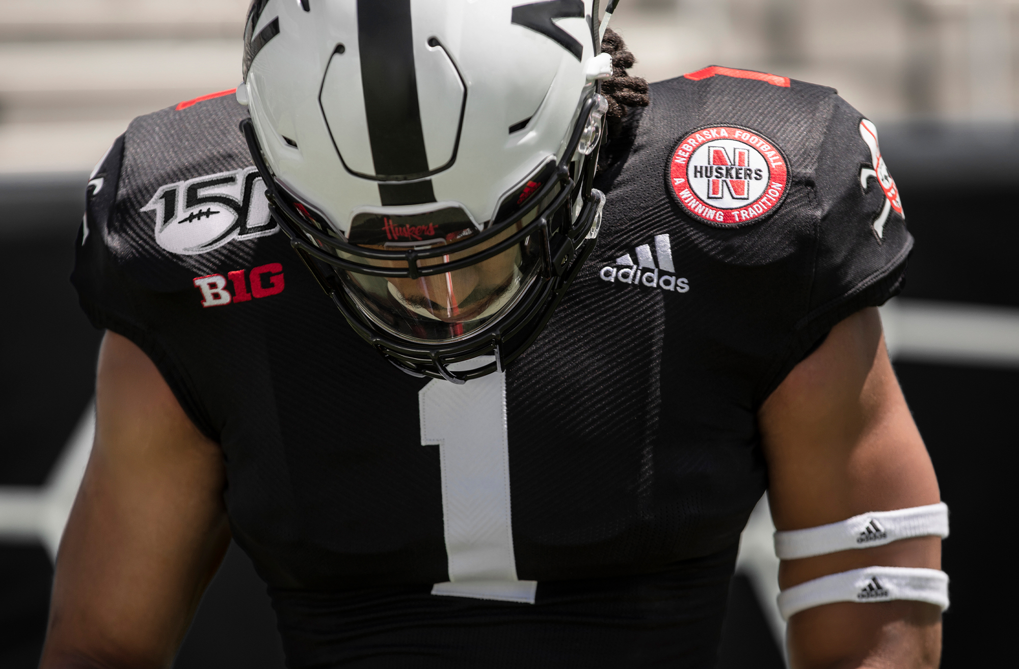
They basically just swapped the stripes on the shoulders for the red numbers and Blackshirt emblem.
Mierin
Assistant Coach
There’s nothing wrong with these, but didn't Adidas just package our practice jerseys and call them an “alternate?”
I don’t care, because the practice jerseys look good.
Born In The Corn
Three-Star Recruit
...... Like last year??? Give me a break.Meh.
Is it that difficult to just do throwback jerseys every few years?
The 1962 style we wore in 2009 are by far better than anything else we have done.
In the Deed the Glory
All-Conference
Those are bad a$$.
Landlord
Banned
...... Like last year??? Give me a break.
Yeah it's not like 2017 and 2018 were both throwbacks or anything :lol:
Born In The Corn
Three-Star Recruit
Yeah it's not like 2017 and 2018 were both throwbacks or anything :lol:
I had forgot about 2017's, but you are correct. They were also throwback. I love these.
broganreynik
Starter
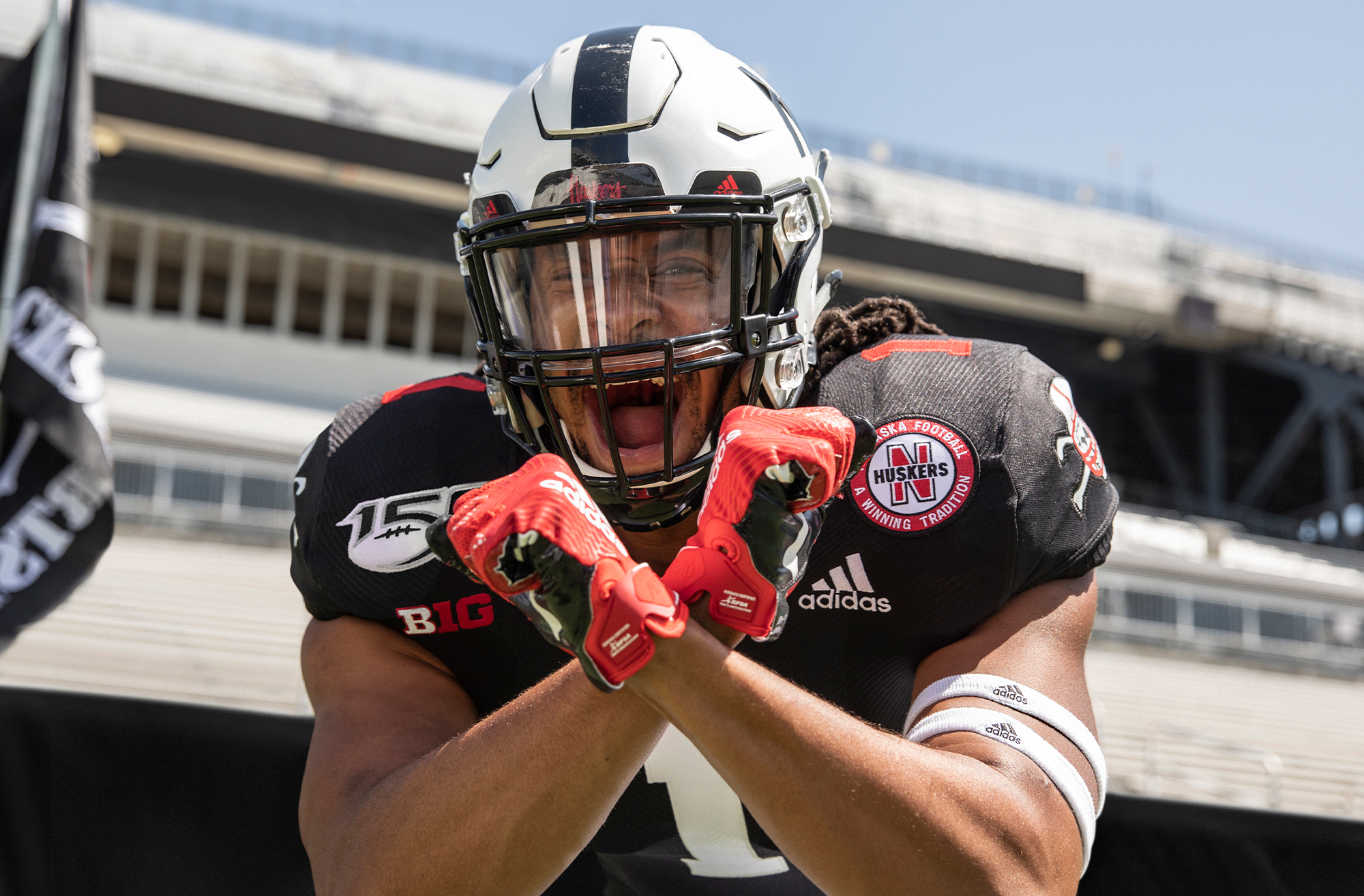
This damn patch is maddeningly cumbersome. Colorado is just going with a helmet sticker. It would make a lot more sense for that, considering we already have three different shoulder dressings. Also, adidas could have put their logo back to the middle for these, it would have made it a little more bearable.
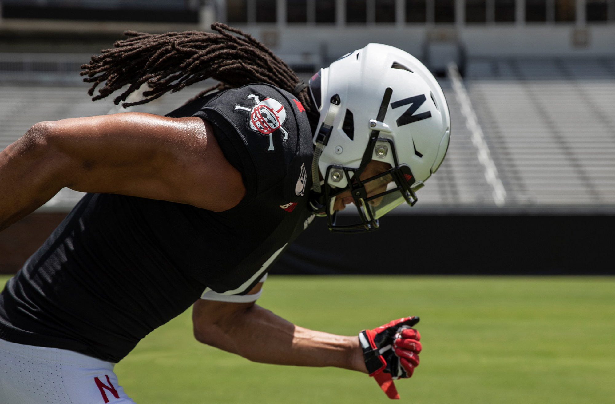
The Blackshirts emblem is cool in theory, but it just adds to the mucky muck on the shoulder pads. It looks like we’re wearing a NASCAR uniform.
Last edited by a moderator:
Mierin
Assistant Coach
This damn patch is maddeningly cumbersome. Colorado is just going with a helmet sticker. It would make a lot more sense for that, considering we already have three different shoulder dressings. Also, adidas could have put their logo back to the middle for these, it would have made it a little more bearable.
The Blackshirts emblem is cool in theory, but it just adds to the mucky muck on the shoulder pads. It looks like we’re wearing a NASCAR uniform.
I would prefer if we only had the Adidas and B1G patches. The red circle patch is silly too in my opinion even though we used it during successful years. It has no specific meaning. People know about Nebraska, why do we need to tell them on our uniform that we have traditionally won many games? Also, those pads were gigantic so we had a lot more real estate to work with.
Last edited by a moderator:
broganreynik
Starter
I would prefer if we only had the Adidas and B1G patches. The red circle patch is silly too in my opinion even though we used it during successful years. It has no specific meaning. People know about Nebraska, why do we need to tell them on our uniform that we have traditionally won many games? Also, those pads were gigantic so we had a lot more real estate to work with.
I’m with you, 100%.