Alternate Uniforms 2019

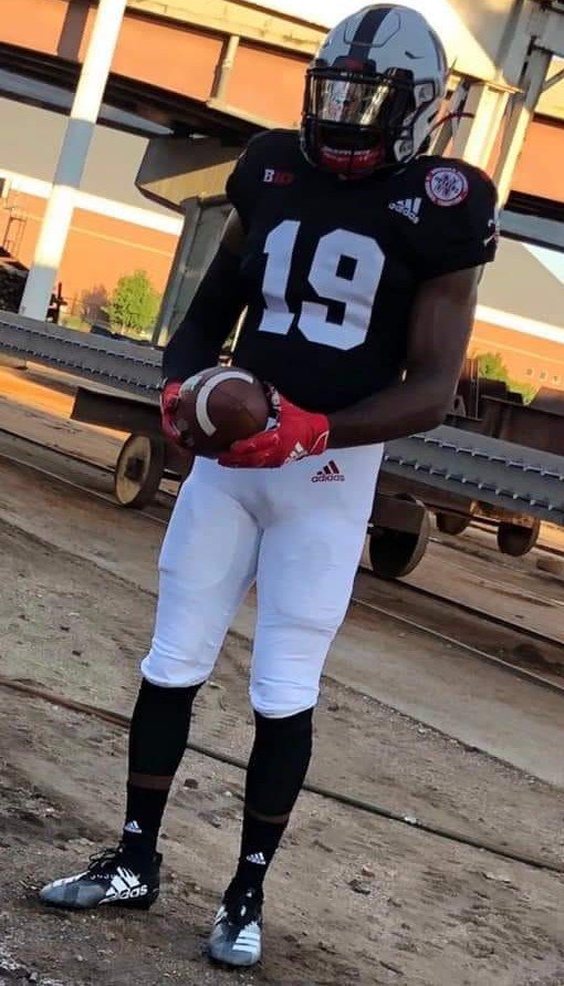
I cant quite tell, does it look like a red tv number on top of the shoulders or is that just the sun?


I think so but I'm not sure either. I hope they will play more with the BS logo in the future. They could put it on the helmet at some point.

 
Last edited by a moderator:
This photo looks slightly clearer.

EB4zbj_UYAAdmQP.jpg:large


2013 for comparison:


I liked that alternate, but I like this one better. Seems like using the Blackshirts logo is a no brainer. One thing I like about seeing other teams' alternate uniforms is when they incorporate the different logos and symbols they've used historically.

 
Last edited by a moderator:
These are excellent. Adidas finally executed a great looking alternate.

Guarantee we have our first actual university sanctioned blackout game this year. Going from the sea of red to the black sea is an aesthetic I can't wait to see.

Love the modern, creative and cool direction this program is taking while maintaining its traditions. 

 
Hadn't read this before.

https://hailvarsity.com/s/4475/the-unforgettable-origins-of-nebraskas-blackshirts-logo

Guy who made it wanted to put it on a banner to hang over the railing at the stadium for the Florida State game in 1985.

“I didn’t think the Board of Regents or coach (Tom) Osborne would care for it,” Justman said.

Riley also wondered what the university’s reaction would be.

“It’s a little aggressive looking,” he said. “I thought, before I launch off into this, rather than get in trouble with the university, I should probably check it out.”


“I don’t remember who took me up to the office, but I told them what I wanted,” Riley said. “They took me up and I held him up the design and [Osborne] said something like, ‘Looks good to me.’


“Walking into the stadium, I was stopped by like a thousand people asking ‘where did you get that, where did you get that, where did you get that?’”


Last edited by a moderator:
Back
Top