You are using an out of date browser. It may not display this or other websites correctly.
You should upgrade or use an alternative browser.
You should upgrade or use an alternative browser.
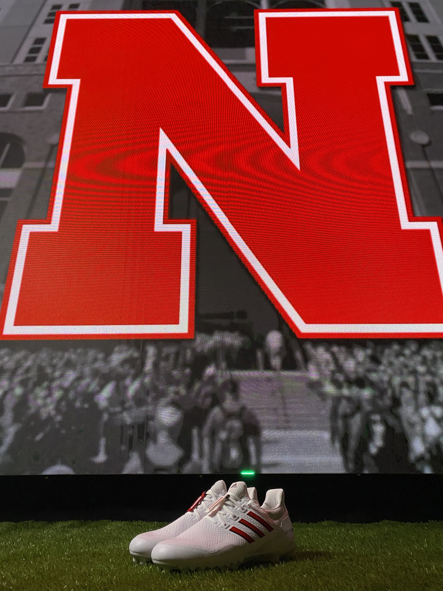
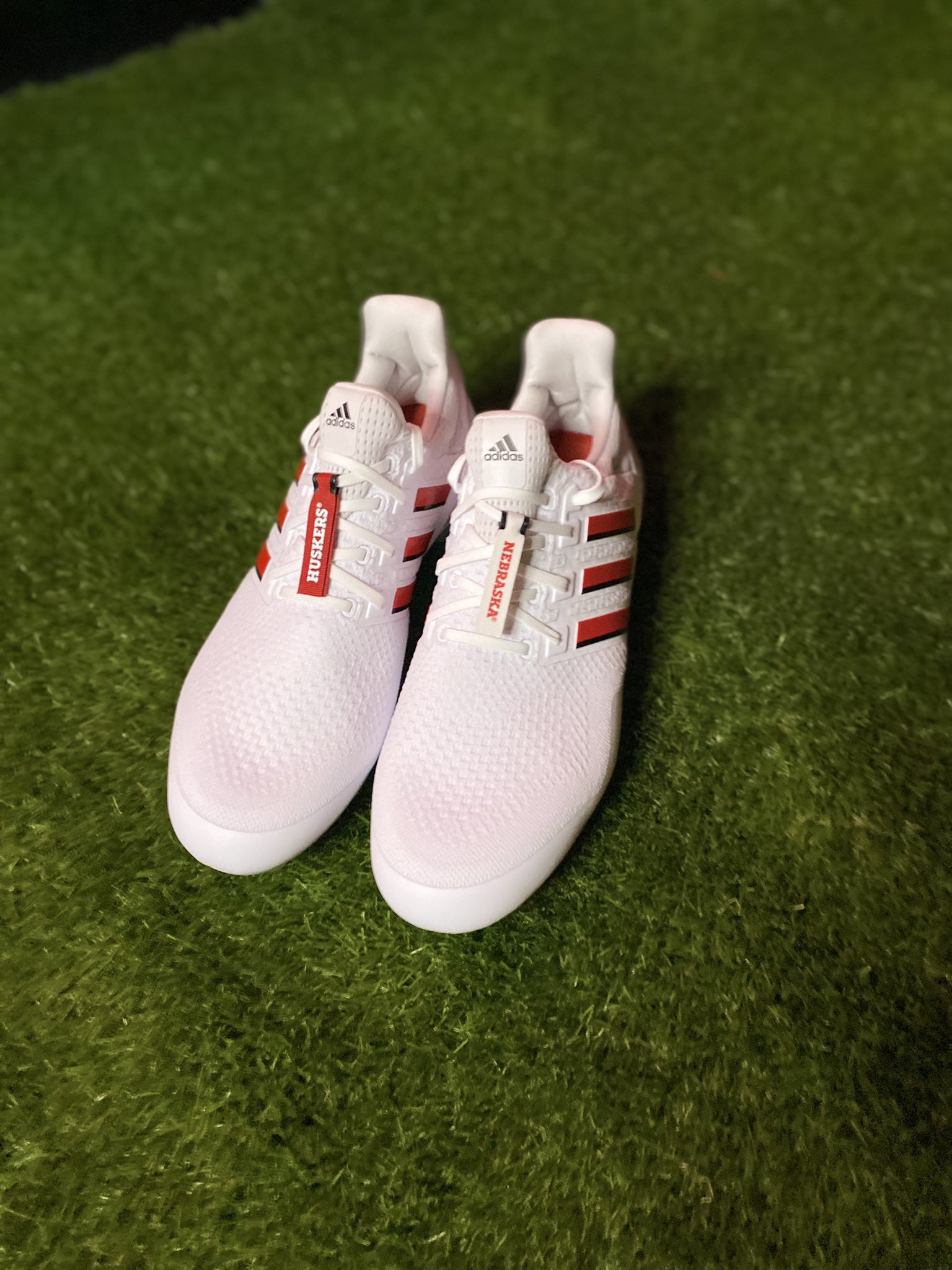
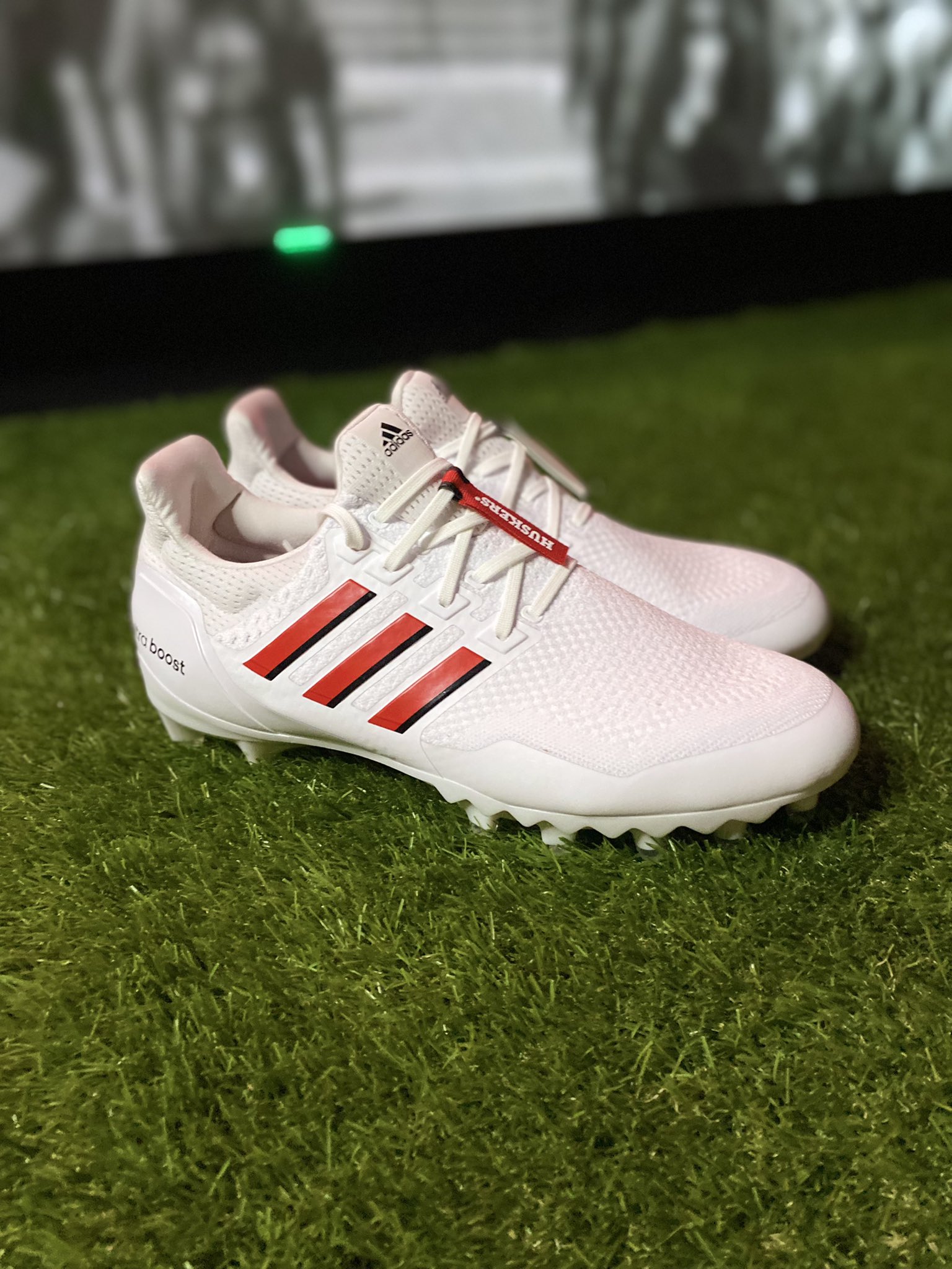
2022 Alternate Uniforms - The Scoring Explosion
- Thread starter Mavric
- Start date
Wouldn't it make more sense to have 1983 throwbacks next year for the 40th anniversary of that team?
Kinda like how we wore the 1997 throwbacks on the 20th anniversary of that team?
Yeah, that seems kind of odd to me as well.
Other than Adidas just doesn't have any other decent ideas for alternates so they only thing they can do well is throwbacks.
Huskerfollower4life
All-Conference
What i don't get is why doesn't Nebraska make some of the alternate uniforms permanent? The fans love them and so do the players saying some not all. Im not a fan of making new uniforms year after year. Some of the ones they made for one game can stay in the closet while others should be used or have the choice to be worn.
talaricohusker
Starter
Idk its putting more of a meh vibe off to me. if your going to do a alt once a year I think the more wacky and crazy the better its makes it fun for the players I think. I understand paying homage to previous teams and celebrating those championship teams but its meh like we have been there beforeThese are freakin sick.
ZRod
Heisman Trophy Winner
This is like the Penn St alt. Nobody is even going to notice a difference...These are freakin sick.
Husker in WI
All-Conference
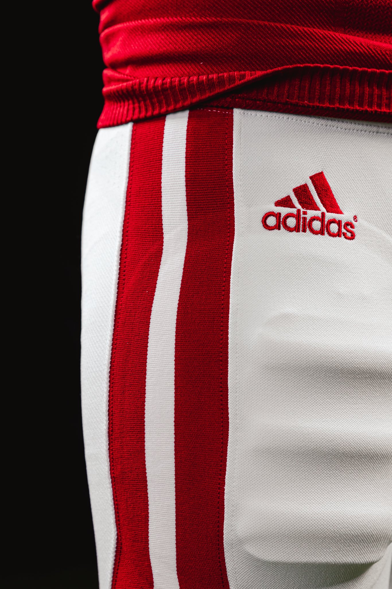
Nothing crazy, but I do like how the replicate the old mesh look with the numbers. I like them better than last years, but I wouldn't mind one game in throwbacks and one in a true alternate. The throwbacks just aren't that different unless you go back to the 60s.
Red Five
Heisman Trophy Winner
This is like the Penn St alt. Nobody is even going to notice a difference...
The N on the sleeve will be different.
But take that out and they are like the 1997 throwbacks, which looked just like our normal uniforms.
Adding dots to the front/back numbers trying to make them look like mesh doesn't show up if you are more than 5 feet away from the jersey.


/cdn.vox-cdn.com/uploads/chorus_asset/file/19897212/72924272.jpg.jpg)
Saunders
Heisman Trophy Winner
Really? I think that's my favorite part. Adds a nice touch of contrast.Not a fan of the white small stripe on the bottom of the sleeves. It looks pointless. I can't say the Adidas uni's have been that great to begin with for me especially their dreadful alternates so far.
Red Five
Heisman Trophy Winner
Really? I think that's my favorite part. Adds a nice touch of contrast.
And that white stripe is not on the 83 uniforms...
Last edited by a moderator: