You are using an out of date browser. It may not display this or other websites correctly.
You should upgrade or use an alternative browser.
You should upgrade or use an alternative browser.
Big Ten Division Names and Logo Released
- Thread starter MichiganMan
- Start date
junior4949
All-American
The more I think about it, the more I realize that it's typically always been this way. I still remember in our seven or eight bowl game slide hearing fans around here make the excuse for the losses that we didn't recruit from prisons like OU and Miami did. I still remember all the whining and bitching about CU when they beat us three in a row of how dispicable it was using a players death like that to motivate a team. If I had to bet, I'd bet most fan bases are like this. I bet there are a lot of fan bases that think ESPN hates them.I thought that X and O for division names was pretty cool. Abstract, but still relevant.
i'd kinda hoped for those to remain the division names since they came out with them.
other than that, the general bitchyness around here has officially become laughable, at least to me.
still bitchin with the big 12, and now we wanna b!^@h at the big 10 because they didnt name enough awards after us. really? what has the big 10 not done so far to show they are nothing but accommodating? between delany flying in to stand next to dr tom and announce it, to schools like michigan placing a husker helmet in their display this past summer, the big 10 network playing husker pieces, etc...it goes on and on. please dont start this "us against the world" crap before we even sit down for our first big 10 meal. its embarrassing.
krill
Special Teams Player


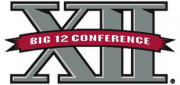


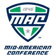


Ranking these purely on aesthetics the Pac-10 and MAC would be at the top, the MWC, B12 and ACC at the bottom and everything else somewhere between. The smaller logo will look good on fields, courts and TV though...that's what really matters. In that respect the Big East logo looks the best right now because of the simplicity and lettering. When you see the B10 logo on a basketball court it will look even better.
The division names are kinda gimmicky, can't really defend them.
AllTheGoodNamesAreTaken
Five-Star Recruit
i have a feeling that over the next few years, we're all going to come up with our own names for the divisions anyway.
krill
Special Teams Player
Yeah, and it's not like they are set in stone either. If they are not accepted by the fans and / or become a constant babble point on TV they could change them next year.i have a feeling that over the next few years, we're all going to come up with our own names for the divisions anyway.
ESPY
Starter
Methinks some of the talented design folks on HB could outdo the Pentagram Michaels mentioned above. Anyone wanna give it a try now that we know the conference is sticking with "Big Ten"?The new Big Ten logo was developed by Michael Bierut and Michael Gericke of the international design firm Pentagram.
BIGREDFAN_in_OMAHA
All-American
This sounds like something they came up with right before the presser...
huskerSoldier321
Four-Star Recruit
Hmm I really didn't think about that. Makes perfect sence and the name stays the same. NU just completed the big 10 (states).Big 10 = 10 states not 10 teams
just tell everyone that when they say "but they have 12 teams"
ESPY
Starter
Big 10 actually covers only 9 states.Hmm I really didn't think about that. Makes perfect sence and the name stays the same. NU just completed the big 10 (states).Big 10 = 10 states not 10 teams
NUance
Assistant Coach
So now I guess we get to figure out who the 10th state is? Mizzou perhaps?Big 10 actually covers only 9 states.Hmm I really didn't think about that. Makes perfect sence and the name stays the same. NU just completed the big 10 (states).Big 10 = 10 states not 10 teams
mmmtodd
All-Conference
So now I guess we get to figure out who the 10th state is? Mizzou perhaps?Big 10 actually covers only 9 states.Hmm I really didn't think about that. Makes perfect sence and the name stays the same. NU just completed the big 10 (states).Big 10 = 10 states not 10 teams
Texas. duh.
huskerSoldier321
Four-Star Recruit
Yep I feel dumb, For some reason I was thinking Purdue wasnt in Indiana. My bad, 9 states it isHmm I really didn't think about that. Makes perfect sence and the name stays the same. NU just completed the big 10 (states).Big 10 = 10 states not 10 teams
:yeah these names will just go away or simply not be used (they'll be good for bar trivia in a few decades tho! (imo)Yeah, and it's not like they are set in stone either. If they are not accepted by the fans and / or become a constant babble point on TV they could change them next year.i have a feeling that over the next few years, we're all going to come up with our own names for the divisions anyway.