You are using an out of date browser. It may not display this or other websites correctly.
You should upgrade or use an alternative browser.
You should upgrade or use an alternative browser.
2015 Alternate Unis
- Thread starter Thanks_Tom RR
- Start date
girlknowsfootball
Starter
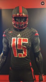
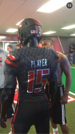
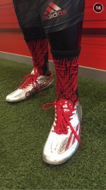
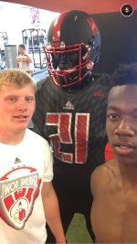
They look at lot better in those snapchat photos. When I saw the Adidas pics I was like... Oh no. But after seeing them on snapchat they look pretty decent. I like the silver shoes. I think those will pop on TV. I question the silver names on the back though. Kinda think they might be hard to read on TV and we may have a situation similar to last year's metallic numbers.
The Maudfather
All-American
They look worse in the snapchat pics. The jerseys look like they're more of a charcoal color. Dafuq, Adidas?
Red Five
Heisman Trophy Winner
Adidas is so bad that they put the lettering and numbers backwards on all their gear.Here's the snapchat photos...
/monthly_07_2015/post-7834-0-77846700-1437659457.jpg">View attachment 10536
Minnesota_husker
All-American
I just dont get them.
The design makes no sense.
What makes nike special, especially the ducks is they incorporate their mascot in the design.
I get some might find it stupid, but why not use the corn kernel design or corn stalk look as a design pattern?
I like the matte look, and like the black look, but wish they would have drastically changed the N on the helmet to make it more different.
Dont hate the black/charcoal grey jerseys, but would still prefer red.
All in all they are not awful or hideous but just sort of "meh". If you are going to do this, do it with a purpose... Have a native nebraskan design the jerseys. Someone who knows the past and tradition but also embraces the future.
Omaha_Style
Three-Star Recruit
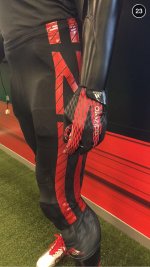
I agree with many who already commented on this thread. I like the black Uniforms for an alternate but am not too crazy about the cross lines on the numbers and stripes. I think they would be much more appealing without that. The helmets are pretty good, I liked all the alternate helmets to be honest. I don't really care for the crazy print on the jerseys but it's not as bad as it could have been. The N on the leg stripe is an original idea that was not executed as well as it could have been. As long as the players and potential recruits like them then I am happy with what they are.
Bigred_inSD
All-Conference
They are alright. Could be better, could be a heck of a lot worse. That said, let's start the 2016 alternative uniform thread
BaytownHusker
Starter
Love them, As do all the younger kids and the recruits we want to play here. Love them.
Omaha_Style
Three-Star Recruit
I agree. I was really hoping for a gray uniform this year.This might be their best effort yet. They're not too bad. Not a fan of the numbers however, must be the stencil font coupled with the diagonal slashes- not good. I do like the helmet, texture/tread on the the body of the uni, pants are ok and the colors seem to be ok. Have to see how they look on the field. Would've preferred something involving gray but the black is ok.
Pornhusker
Four-Star Recruit
Umm....those uni's are fugly. I dig the helmet but they're still fugly.
BigRedBuster
International Man of Mystery
Blackshirt39
Special Teams Player
I like them. The only thing is white cleats with an all black uniform?
Saunders
Heisman Trophy Winner
Yeah, it's like a small oasis in that wretched hive of scum and villany.reddit/CFB is pretty great.

 Eric Lee Jr6⃣
