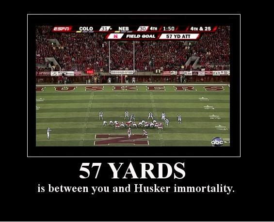
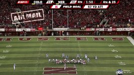
Adidas should make this into a poster

Can someone make it so "impossible" is to the left of the field goal, "is" is in the field goal and "nothing" is on the right of it? maybe think of something else to put in it..they are all good but kind of bland.

I think a better one would be "Impossible" in the way upper left with "is Nothing" below the "K E R S" in the endzone.

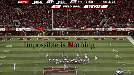
 
Impossible is Nothing makes no sense. I know what you are trying to say - but it doesn't make sense.

Nothing is Impossible is more fitting a accurate.

Better yet

Know No Limits

The last picture is more than cool.

 
Last edited by a moderator:
heneryadidaspostermw8.png
Dang, now that is SICK! :clap

 
Impossible is Nothing makes no sense. I know what you are trying to say - but it doesn't make sense.

Nothing is Impossible is more fitting a accurate.

Better yet

Know No Limits

The last picture is more than cool.
No, brah, "impossible is nothing", i.e. "impossible is (like/like doing) nothing". Like a 'walk in the park'.

"Impossible is nothing(easy for us)." That syntax is just fine, IMO.

 
sure...i have to go to work now..but ill be home around 10...could have you one by 1045 11.....would you like the font i used on the suh picture? alot of people seem to like that one. i assume you want the red on the field to pop more? as well as the font? i will see what i can do.
Yeah, that font would definitely work (in red of course). Yes to all of the other questions.

And do it whenever you have time. I'm in no hurry.

However, I do think a wallpaper needs to be made for the Clemson/Nebraska matchup at the Gator Bowl...
And could you pick me up a few Runzas while you're at it! :lol:

 
Back
Top