Husker from Kansas
Starter
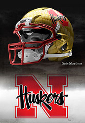
I totally agree with Landlord on this, in trying to preserve the tradition that is Nebraska football, the fan base has made the university and its sponsor feel like it cant do something cutting edge with its uniforms for one game. sometimes the best of intentions have negative results.Other than the fact that the players were saying the small numbers on the front were tough to read to figure out match-ups, what do you all think of the N (instead of large numbers) on the front now after having seen them in the game? When I went home for the spring game this year, the topic came up and the large majority in our large group said they weren't a fan of them. I was surprised to hear that from most of them because they seemed to be the type that would like the look. So I was just curious of the overall perception of the N on the front now.
The fanbase did a lot of complaining about the uniforms, but it's really the fanbase's fault that they looked that way. The university and Adidas were too terrified to do anything even remotely close to possibly being considered MAYBE outlandish that they just did not have a lot of options.


")