You are using an out of date browser. It may not display this or other websites correctly.
You should upgrade or use an alternative browser.
You should upgrade or use an alternative browser.
Primeknit A1 uniforms
- Thread starter 12Husker12
- Start date
swmohusker
All-Conference
Like them. Wish they wouldn't have used local high school kids to model them.
husker98
Starter
It's not really traditional until we change back to this font.

omg can we please? loved the throw backs of these we wore some years ago.
12Husker12
Walk-on
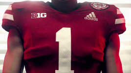
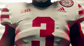
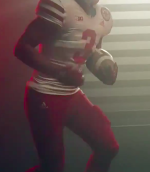
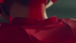
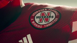
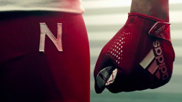
Here are some freeze-frames showing the details. The Adidas prime knit collar is pretty cool. The numbers appear to have the ribbed pattern continued onto them which I thought was interesting. Hopefully they just made a mistake on the white pants without the Red N. I don't know why they would figure to remove the N on the white pants and keep it on the red pants. The N patch looks way too high and cluttered next to Adidas logo IMO, they should have just kept Adidas logo in the center or below the B1G logo. Last photo shows a partial side view, definitely showing no stripes on pants which will be a clean look! Overall this is drastic improvement over their previous versions, but Adidas never seems to get it just right.


Last edited by a moderator:
Red Rogue
Three-Star Recruit
Well it’s not like they just have a bunch of D-1 football players around they could.... oh wait.Those models are scrawny.
ColoradoHusk
Heisman Trophy Winner
You guys do realize that those photos and videos are done by Adidas, and not Nebraska. That’s why they have skinny “models” in the uniform.Well it’s not like they just have a bunch of D-1 football players around they could.... oh wait.
Lonestar_Husker
Special Teams Player
I think they look good. One thing I'm noticing from the close up shots is the inconsistent pant logoing. The red pants have a white "N" on left hip and a white Adidas logo on the right hip. The white pants just have the black Adidas logo on the left hip, no "N". I think removing the pant stripes will lower the chances of sporting all white or all red uniforms in the future. I don't have an opinion if that is good or bad.
Edit: The numbers 1 and 3 were used as an indication of the number of wins Adidas is predicting for Nebraska. Which means we lose in the championship game. :koolaid2:
Edit: The numbers 1 and 3 were used as an indication of the number of wins Adidas is predicting for Nebraska. Which means we lose in the championship game. :koolaid2:
Last edited by a moderator:
Swiv3D
Starter
I mean yeah, but they used athletic looking models for the alternatesYou guys do realize that those photos and videos are done by Adidas, and not Nebraska. That’s why they have skinny “models” in the uniform.
Mierin
Assistant Coach
Yes.You guys do realize that those photos and videos are done by Adidas, and not Nebraska. That’s why they have skinny “models” in the uniform.
While we're talking about the hunkiness of men in uniform, I'm really liking the spandex shorts the team is wearing for fall camp.
gorp512
Starter
Those look incredibly clean. Gotta imagine Frost had some stern input to give to Adidas considering?
Was there something really wrong with the "old ones"?
Landlord
Banned
Was there something really wrong with the "old ones"?
Wrong would be subjective. Personally, I thought they were just a tiny bit too busy with the pant stripes. Also, the infamous 'tire tread' was sometimes really frustrating (more noticeable in some scenarios than others), before that we had wavy inconsistent shoulder stripes, etc. None of them were 'bad', this one is just a good amount better imo.
desertshox
All-Conference
Well it’s not like they just have a bunch of D-1 football players around they could.... oh wait.
Adidas pays off basketball players not football players.
Last edited by a moderator:
Good point. The patches/logos at the top of the uniform are the only real complaint I have. I think the B1G logo is ridiculous in general but, if it has to be there, I'd prefer it be centered at the point of the neck like it used to be. Then, the Adidas patch could be moved to the right shoulder and the Husker patch could be moved down a bit on the left shoulder.Overall this is drastic improvement over their previous versions, but Adidas never seems to get it just right.
These particular uniforms provide the most nostalgia for me which is why I'm a big fan of experimenting away from the stripes. I was a kid when they made this move and most of my early Husker memories are from uniforms like this.
Last edited by a moderator:

