Landlord
Banned
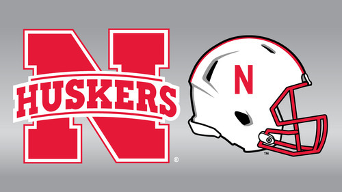
Definitely tried to be to cute with it.
How so? It's incredibly simple.
I think he meant its not anywhere near our original. Sure the "N" is, but he font is hideous, and the lines above both on the banner is just as hideous.
The original? You mean the cursive script? Nothing original about it, it was a secondary logo just like this one. The font is hideous? It's the same font that the 'N' is derived from. The lines are hideous? They're lines. What do you want a line to look like?
Good grief people.