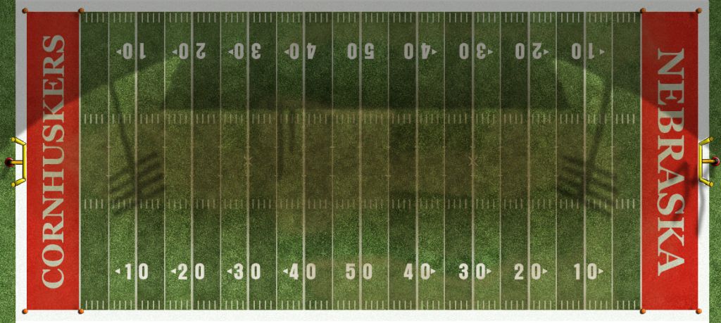
Stadium Expansion

Personally I would like to see grass and red endzones with white "CORNHUSKERS" in one end and white "NEBRASKA" in the other.

Picture the proper font and the B1G logos and N at center field.
So like this?

View attachment 8699
Just change HUSKERS to CORNHUSKERS and it's perfect. You obviously have more skills with this stuff than I do.
Agreed.

You couldn't fit CORNHUSKERS in there while making it look....how should I say, uh, good.

 
I think the two-tone turf was cool, but I think the novelty kind of wore off. It also represents one of our worst periods on the field. I think anything remotely associated with Callahan should be shunned :)

Pick the darker green of the two and go with that.

I'd also be in favor of red end zones... or maybe some other variation. I remember the "HUSKERS" end was always white outlined in red for the longest time, then they flipped it to match the "NEBRASKA" end. I also think they could put a helmet or a B1G logo or something else in one of the end zones, like they do in the Super Bowl.

 
Personally I would like to see grass and red endzones with white "CORNHUSKERS" in one end and white "NEBRASKA" in the other.

Picture the proper font and the B1G logos and N at center field.
So like this?

View attachment 8699
Just change HUSKERS to CORNHUSKERS and it's perfect. You obviously have more skills with this stuff than I do.
Agreed.

You couldn't fit CORNHUSKERS in there while making it look....how should I say, uh, good.

I disagree, if you can fit INDIANAPOLIS in an endzone and make it look nice you can certainly fit CORNHUSKERS in. And just as my illustration showed. But don't take my word for it.

0629_12246_10_08_HUN1_PSa_Interior.jpg


I disagree, if you can fit INDIANAPOLIS in an endzone and make it look nice you can certainly fit CORNHUSKERS in. And just as my illustration showed. But don't take my word for it.

0629_12246_10_08_HUN1_PSa_Interior.jpg


The reason it works in Indy is because their font has a very high vertical stretching. It would not work at Nebraska because we use a specific block font in which the letters are particularly square-sized, not tall rectangles. Hypothetically, we could shrink it to fit, but then you'd have to shrink the "NEBRASKA" end to match, and it wouldn't take up it's maximum real estate.
Yeah, what this guy said.... On another note, Lucas Oil Stadium is among my favorite....Love the "fieldhouse" feel...

 
I disagree, if you can fit INDIANAPOLIS in an endzone and make it look nice you can certainly fit CORNHUSKERS in. And just as my illustration showed. But don't take my word for it.

0629_12246_10_08_HUN1_PSa_Interior.jpg


The reason it works in Indy is because their font has a very high vertical stretching. It would not work at Nebraska because we use a specific block font in which the letters are particularly square-sized, not tall rectangles. Hypothetically, we could shrink it to fit, but then you'd have to shrink the "NEBRASKA" end to match, and it wouldn't take up it's maximum real estate.

The font can be thinned out, tweaked, or just changed. It can be made smaller as well. I see no problem with any of this and people who have skill in graphic design would have no problem coming up with something.

It doesn't look bad anyhow to have more "real estate" on the Nebraska side anyway:

NUfield.jpg


Last edited by a moderator:
While we're at it, I'll throw this out there. I wouldn't mind making the midfield :bigredn: a little larger.

 
I disagree, if you can fit INDIANAPOLIS in an endzone and make it look nice you can certainly fit CORNHUSKERS in. And just as my illustration showed. But don't take my word for it.

0629_12246_10_08_HUN1_PSa_Interior.jpg


The reason it works in Indy is because their font has a very high vertical stretching. It would not work at Nebraska because we use a specific block font in which the letters are particularly square-sized, not tall rectangles. Hypothetically, we could shrink it to fit, but then you'd have to shrink the "NEBRASKA" end to match, and it wouldn't take up it's maximum real estate.

The font can be thinned out, tweaked, or just changed. It can be made smaller as well. I see no problem with any of this and people who have skill in graphic design would have no problem coming up with something.

It doesn't look bad anyhow to have more "real estate" on the Nebraska side anyway:

NUfield.jpg


Using the official University font, these are the two main options, and that's only taking up as much of the end zone as possible:

NOP.png


Last edited by a moderator:
We could always go the ND route and pretend we're too poor for colored paint and just hash the end zone.

 
Using the official University font, these are the two main options, and that's only taking up as much of the end zone as possible:

NOP.png
Not seeing anything here.

But, usiing the current font is fine, just make it smaller, it doesn't need to be painted on the field for the visually impaired. No reason it has to go from goal line to the out of bounds lines all the way around. I don't mind doing that as it is now because it puts the most amount of color in the endzone. But if the endzone is red, you can make it work.

 
Last edited by a moderator:
Back
Top