You are using an out of date browser. It may not display this or other websites correctly.
You should upgrade or use an alternative browser.
You should upgrade or use an alternative browser.
Wanna throw out some feedback?
- Thread starter killer cacti
- Start date

Landlord
Banned
kc you continue to kill it
I got to revamp an earlier poster design I made to advertise for the opening basketball weekend at wayne state:
User Actions
Following
 WSCWomensBasketball@WayneStateWBB
Hope to see all of you Wildcat fans this weekend at our opening weekend tournament! #ourhouse #ourteam


I got to revamp an earlier poster design I made to advertise for the opening basketball weekend at wayne state:
User Actions
Following
WSCWomensBasketball@WayneStateWBBHope to see all of you Wildcat fans this weekend at our opening weekend tournament! #ourhouse #ourteam
killer cacti
All-Conference
Probably shouldn't post this because yall are gonna eat me alive, but:

Took a sports logo online class and was going to do the USF Bulls redo, but that green and gold just didn't work. Instead I used a color similar to the color of the reference picture I was using and it came out a bit TexASS-esque. Forgive me.
Took a sports logo online class and was going to do the USF Bulls redo, but that green and gold just didn't work. Instead I used a color similar to the color of the reference picture I was using and it came out a bit TexASS-esque. Forgive me.
icedavis
Five-Star Recruit
I like it. It has a different feel to it than the usual team logos. I wanna say i think that because it feels like it has a little more texture than the ones we usually see but i am not quite sure if that is it...but I dig it.Probably shouldn't post this because yall are gonna eat me alive, but:
Took a sports logo online class and was going to do the USF Bulls redo, but that green and gold just didn't work. Instead I used a color similar to the color of the reference picture I was using and it came out a bit TexASS-esque. Forgive me.
killer cacti
All-Conference

killer cacti
All-Conference

killer cacti
All-Conference


killer cacti
All-Conference
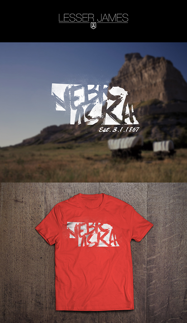
Concept for Nevada:
