The Duke
All-Conference
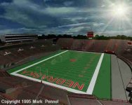
I have no issue with the new red end zones. It certainly pops in the pictures.
However, this is just a personal preference on my part, but I really do prefer the old sans-serif lettering that we used to use where the "N" in NEBRASKA and the N at the mid-field logo matched the sans-serif N on our helmets.
I always thought this was a great clean look. I think it went away around 2002 or 2003.
Maybe they can bring this look back when they put in the grass turf after the stadium expansion is finished.
Another idea would be to keep the new red endzone color and just bring back the old sans-serif lettering.


Last edited by a moderator:
