QMany
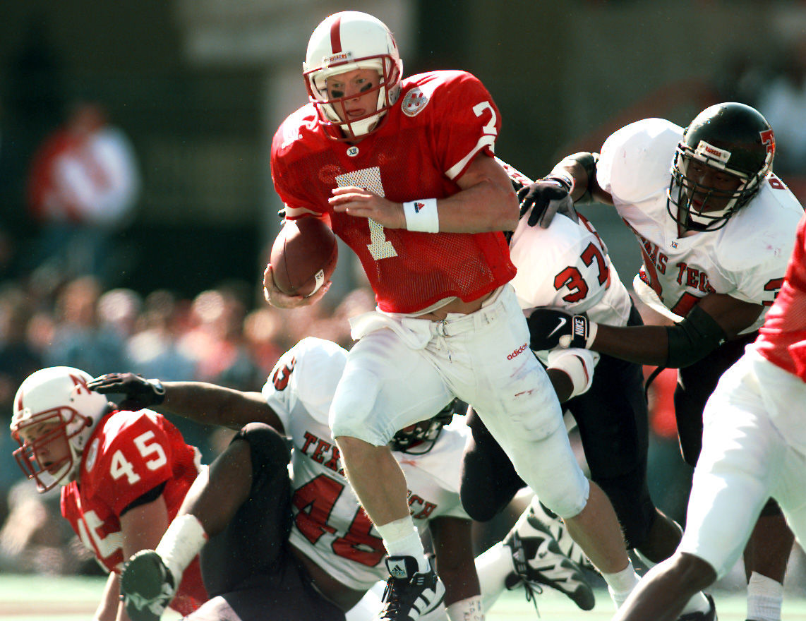
All-American
I've said for years that would be the best way to go.
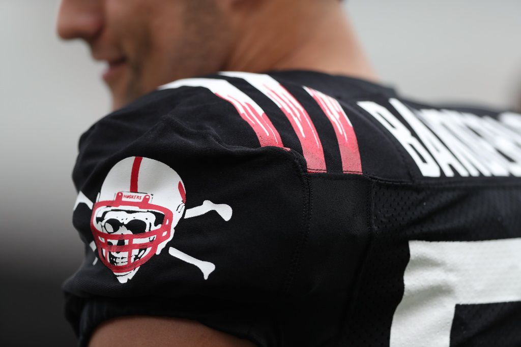
They basically just swapped the stripes on the shoulders for the red numbers and Blackshirt emblem.
I agree, I've been asking for something like this for years.
We've had the Blackshirts emblem for a few years. I think they did just swap stripes for numbers and add the normal game patches.
EDIT:
IMHO, this is wayyy too many patches on the front.
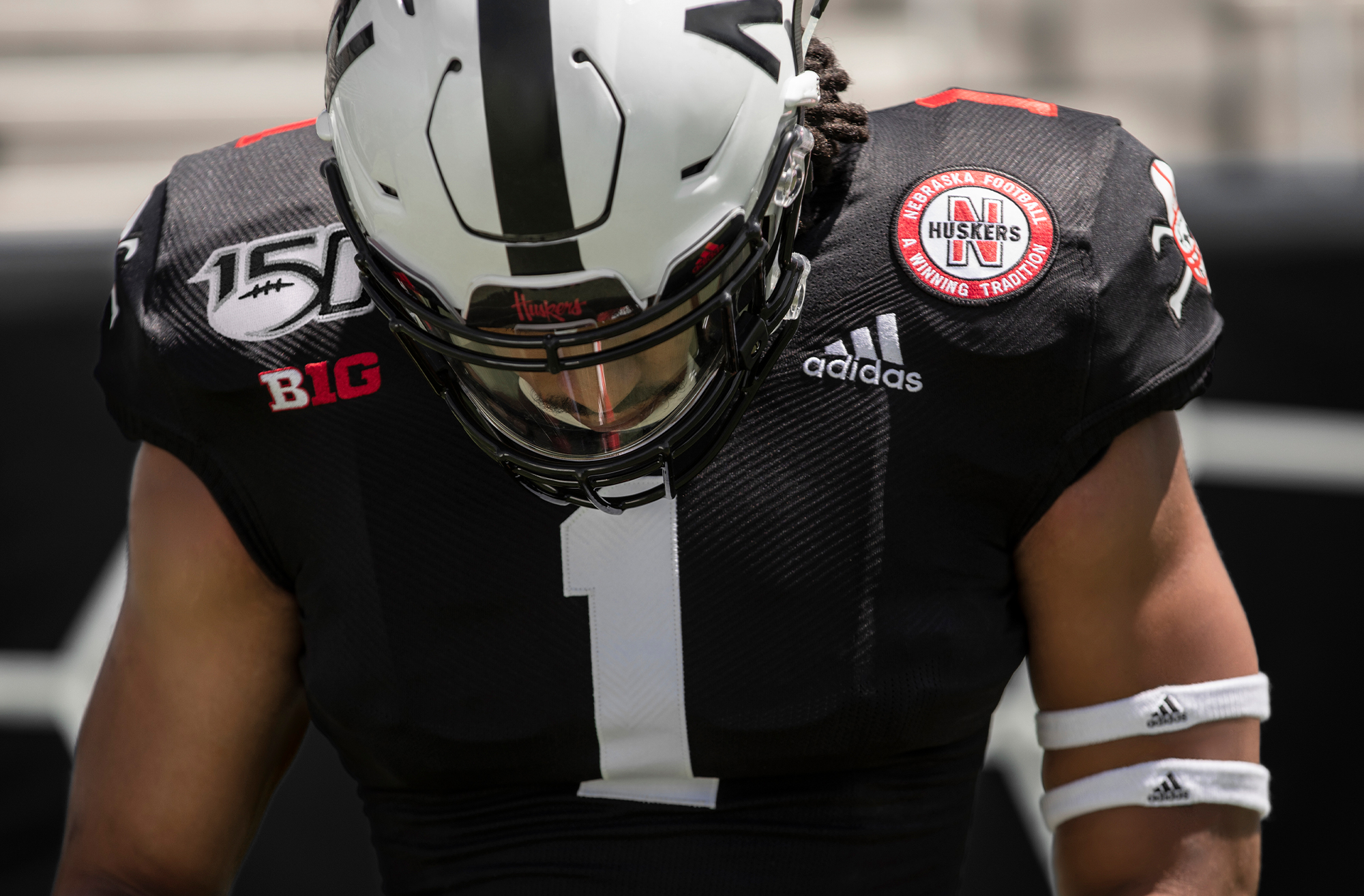
Just the B1G and adidas would look great!
Last edited by a moderator: