


Twinkletoes Flintstone
-
Posts
203 -
Joined
-
Last visited
-
Days Won
1
Content Type
Profiles
Forums
Events
Articles
Media Demo
Posts posted by Twinkletoes Flintstone
-
-
-
Grey would be a HUGE downgrade IMO. Honestly don't understand why everyone is so anxious to get away from red, makes no sense to me.
-
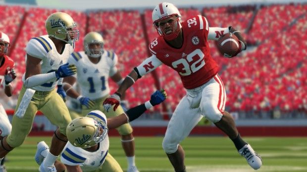
Bought the new NCAA Football game for my PS3 yesterday and saw we have grey facemasks.
Do they know something we don't?
It would be hard to imagine they screw something like that up.
Anyone know anything about grey facemasks?
PS - I kinda like the way they look. Sort of old school.
Please god no! Hate grey facemasks, the RED needs to stay.
edit: all the screen shots I have seen show red masks.
Per a review in the LJS
-
Yeah, I agree about the color changing, will look a little lighter and dulled IMO.
Here is a pretty cool video on how they actually make this stuff.
-
 1
1
-
-
Knapp, It looks like the top part in the middle of the stadium expansion is unfinished. Are they putting windows in that place or something else? anyone else notice it?
Pretty sure the windows are already in there. What you are seeing is the finishing detail is still missing, and yes, that will be filled in.
-
-
Awesome pics and once again thanks for the update for us out of towners!
-
Pretty sure that I read UCLA will be in their traditional road uni's.
-
Kind of off topic, and not a real big deal, but would anyone else like to see the pro style colored goal posts? The white is kind of hard to see IMO.
I would like to see black goalposts. I just happen to think that would be neat.
Yes. I went there.
Well, that would be...................unique.
-
Kind of off topic, and not a real big deal, but would anyone else like to see the pro style colored goal posts? The white is kind of hard to see IMO.
-
Keeping up with the Joneses, eh boys?
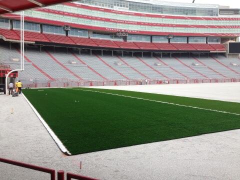
 We just finished up our new field turf in War Memorial Stadium. Still have to lay in the rubber pellets, which will fix the brownish look the sand fill left.
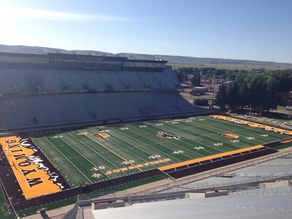
Now THAT is a cool design!
-
I like the old astro-turf. If we ever wear throw-back uni's again, I'd like for them to roll out the astro-turf for that game. - not really possible i know, but it'd be cooler than black uni's for one game in my eyes.
-
2
-
-
Put me on the natural grass side. I just love the smell and look so much more. However, I realize that is never gonna happen at NU. I will say though, the Field Turf makes it so much more tolerable, at least it looks more like the real thing. I REALLY hated that old astro turf stuff. It was so ugly and why they couldn't ever get it in a more natural turf color is beyond me.
Moving forward, I wish Field Turf looked a little more like the real thing, it's almost too perfect looking as it is.
-
Here's the East Stadium in all it's current glory. Pic from this afternoon.
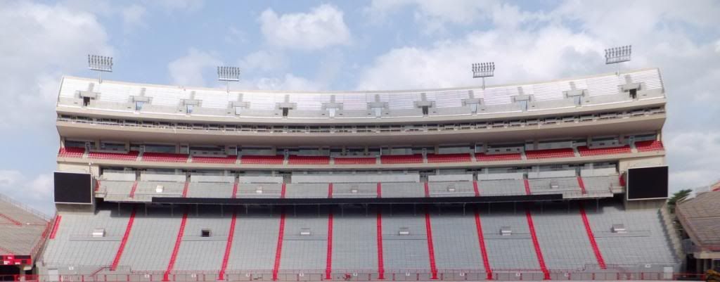
Woah! Did they demolished the "steps" above the two huskervision screens? That kinda bums me out actually...
*edit: It might be that I cannot see them clearly here and they're still there.
Look at the signature on Mr. Accountability a few posts up, they are still there. Very noticeable with the different angle.
-
So when are they putting up the 2nd ribbon?
I know it was on one of the renderings. But have we heard that there definitely is a second one going in?
-
I am all for an alternate uni game. The one thing that is a must for me from a design aspect though is to leave black out. It's just not needed IMO. I liked the unis last year except for that. IMO they would have been better without the black and maybe have done red helmet with white N. JMO.
With that being said, I was a little disappointed in the lack of creativity in last years uniform. It essentially just inverted some colors (less the "N" on the chest). Adidas can do better than that. I mean, if it's an alternate then it isn't gonna kill anyone to actually make a different helmet. Like the block N or something. On those helmets above that all white with the red outlined N for example. Or the matte red helmet above. Lots of ways to make the uni's different while sticking to red and white.
-
So are there ribbon boards going in right below the highest deck?? And what is that weird space between the top of the club seats and start of the upper deck?
I think those are more suites but I could be wrong.
Yeah. I think the area behind the club seats is club level ammenities, and the areas above that in the upper deck are the suites? Or am I wrong?
Pretty sure that's exactly the way it is.
-
The new turf to be 35 degrees cooler as they will be using cork pellets instead of rubber pellets.
Lighter and cooler. That could be the best way to describe the new playing surface inside Memorial Stadium that's about to be installed this summer.
NU started Monday ripping and rolling up its old FieldTurf — originally installed in 2005 — to prepare for a new, improved version of the same two-toned field.
The new FieldTurf doesn't require as much sand for the base — 40,000 fewer pounds, in fact — and the recycled tires previously used for the top layer of the field will be replaced by small granules of cork.
-
Field turf to be replaced this year.
The best-known property in Lincoln is about to get new carpet.Memorial Stadium’s FieldTurf will be replaced before the upcoming season, an athletic department spokesman confirmed.
The replacement project is set to begin Monday with the removal of the old turf, which served its cause for eight years, installed in the summer of 2005.
The installation of the new surface, which will have the same design as the old one, will be completed before the beginning of fall camp.
No design change. I am bummed to hear this. Was really hoping for red endzones.
-
How do they apply numbers and letters on field turf?
The reason I ask is because if you look at the Husky Stadium cam for their stadium renovation they are laying the new field turf in. I saw yesterday they dragged the big "HUSKIES" letter by letter into the endzone. I would have thought these were painted onto the field. You can see the Pac 12 logos and mid field logo just laying in a random area right now. Click on the Husky Stadium Camera #3 to see what I mean. You can even click on June 7 and see the end zone letters overlapping each other.
-
I think you address it the same way Indi did, just have more negative space and have the fonts the same size.

"NEBRASKA" and "CORNHUSKERS" are closer in size obviously as COLTS is to INDIANAPOLIS so I think it would actually work better, and there would be no need for the added symbols as the COLTS did in that end zone
Have the fonts the same size = yes.
All I'm saying, is make them the same size by making CORNHUSKERS as BIG as possible rather than making NEBRASKA smaller to match. If addict squishes the letters together more, it will have more space to be a bit larger overall. I'm pretty sure I drafted this up several pages ago.
Edit: You're the same person that I had this conversation with months ago

Ha! No worries. I understand what you're saying and that may work too. The way it is now though, on the current field that is, I think it's almost too much, too big.
Surprisingly, I actually kind of like that old school mockup with the white HUSKERS. Didn't think I would.
-
Only difference is that Indianapolis' endzone art is more vertical than horizontal. Unfortunately for you, I don't think you'll see 'Cornhuskers' in the endzone anytime soon for two reasons, one being the difference in size. You just have to keep the art consistent. Cornhuskers and Nebraska are unevenly sized with the official font that NU uses. One cannot be stretched taller than the other. It's just sloppy looking and ruins brand identity. The other, Huskers is much more commonplace nowadays than Cornhuskers. I think a good example of this is do you still call it Federal Express or FedEx? They're the same thing, interchangeable really, but FedEx is the mainstream name nowadays.
Yeah, I understand what you're saying. But I still think you could scale down NEBRASKA so that it's height is the same as the CORNHUSKERS , the resut would be that there is more red showing on each side, so instead of the NEBRASKA going from one sideline to the next, it might start 5 yards from the sideline and end 5 yards from the other. If that makes sense.
I agree this is a pipe dream for me with the CORNHUSKERS vs HUSKERS, just would love to see it return. Again, thanks for the mockup!
-
Huskeraddict, can I make a request? Can you mock one up with alternating (oregon style or NU style), red endzones w/white lettering but scale the font size back and have "cornhuskers", and make the B1G red? I am just curious what that would look like and I have no skill with this.

That is absolutely bad ass!! Although, in retrospect I guess the B1G does look better white. But everything else is superb! Let's hope they pay attention as with the basketball court!!
If they do, one tweak would be to scale "Nebraska" down to match the same size as "Cornhuskers", it would leave more red on the sides but I think that would be fine, ala the Colts.**Thanks for doing the Huskeraddict, appreciate it!
Or decrease the kerneling on 'Cornhuskers' to make it take up more space
 you need them to be the same size characters, but the spacing can differ.
I think you address it the same way Indi did, just have more negative space and have the fonts the same size.
"NEBRASKA" and "CORNHUSKERS" are closer in size obviously as COLTS is to INDIANAPOLIS so I think it would actually work better, and there would be no need for the added symbols as the COLTS did in that end zone
-
Huskeraddict, can I make a request? Can you mock one up with alternating (oregon style or NU style), red endzones w/white lettering but scale the font size back and have "cornhuskers", and make the B1G red? I am just curious what that would look like and I have no skill with this.
That is absolutely bad ass!! Although, in retrospect I guess the B1G does look better white. But everything else is superb! Let's hope they pay attention as with the basketball court!!
If they do, one tweak would be to scale "Nebraska" down to match the same size as "Cornhuskers", it would leave more red on the sides but I think that would be fine, ala the Colts.**Thanks for doing that huskeraddict, appreciate it!

2013 alt uniform game
in Husker Football
Posted
Pretty sure Alabama hasn't worn an alternate design though, the cut may be pro combat, but the design is their traditional design. I've seen PSU and Texas in this argument as well and pretty sure they haven't done anything different design wise either. This isn't an argument for or against NU doing it on my part, just a clarification more or less. My objection to the alternates NU is wearing is that there is black in them.